To begin, here is a screen grab of an email sent to sony music to tell them that we have used copyright music as part of our A2 Media courswork.
Questions
1. In what ways does your media product use forms and conventions of real media products?
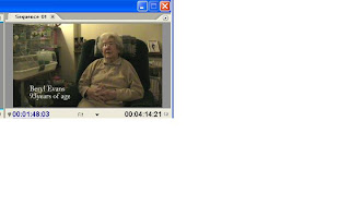
FRAMING
Our interview framing.
Professional interview framing
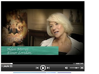
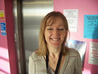
Here is a professional set up for an interview and positioned to the left of the screen is the name of the actor and the relation to the interview, being her stage name in a film.
VOXPOPS
Here is our voxpop shot.
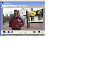
[Q: "What is your favourite sweet and why?"
A: "My favourite sweet is marshmellows, because they're soft and squidgy and go really well with smoors"]
And here is a professional shot of a vox pop taken from a documentary.
 MUSIC
MUSIC'Lollipop - Mika'
ARCHIVE MATERIALVOICEOVERCUTAWAYS
2. How effective is the combination of your main product and ancillary texts?
We have kept all three products easily understandable and simple so that it will appeal to a family audience of all ages.
> We decided on the title 'Allsorts' for this production as it fits in nicely with the context of sweets. Allsorts meaning two different things, one being the name of a sweet that exists and the other meaning 'many things'. This is a technique that can grab the audience into watching the programme because they are intrigued to see what it will be about.
> Another aspect of the production that has been shown across the texts is the slogan, 'Are you sweet enough?'. Again this use of wording is familiar with many people as it is an expression well known. It also gets the audience asking themselves questions and therefore wanting them to be answered in the documentary.
> Channel and scheduling has been decided based on the audience who the documentary would appeal to. We concluded that BBC one would be the most appropriate channel as it already broadcasts alot of family shows such as, eastenders, the weakest link and my family. The day and time also seemed appropriate, Sunday being a the day families get together to have a sunday lunch and relax infront of the television because everybody is off work and school. And to be broadcasted at 7pm means most of the family should still be awake to watch the programme.
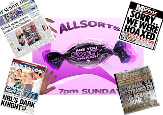
Here is an example of some of the newspapers our print advert would appear in.
*The Sunday Times, The Mirror, The Daily Telegraph and The ECHO*

Here are the radio stations in which out radio advert will appear:


These stations have been choosen because they are each targeted at different age groups and so this will achieve us to attract members of the family of all ages. for example, Juice FM mainly appeals to a teenage audience and younger adults, whereas radio merseyside appeals to an older audience.
Q3. What have you learned from you audience feedback?
>> For this part of the coursework we were asked to create another questionnaire, including approximatley 6 questions to ask the audience watching the production, this would allow us to get positive and negative feedback.
>> After the documentary, radio advert and newspaper print was completed we arranged to set up a session were we showed all three finished products to an audience, the size of approximately 15 people. They all watched the documentary and previewed the adverts which took about 5 minutes.
>> Then the 6 questions we had created were read aloud to the audience and they discussed the products in order to gain research on what the finished product were like.
An example of one of these questions was:
Q. What were the strengths of the first 5 minutes of the documentary?
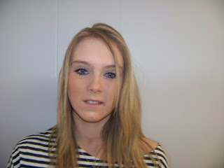
A. "I thought that the title (opening) sequence was good and very effective because its quite a typical look on how the family deal with 'sweets' in my home we usualy end up going to grab the same one, so having this as a start to the programme helped me relate myself to it and i knew from then i would enjoy watching it."
We also created two questions that would help get feebback for the radio and advert and newspaper print.
Q: What didn't you like about the print advert?

A: "I didnt really like the way the hands (coming in from the side angles) were of a smaller size to the sweet in the middle, i think it may have worked better if the hands were bigger than the sweet."
Q: What was effective in the radio advert?
A: The extracts taken from the documentary were really appropriate for the radio advert as it grabbed my attention and made me ask myself ' what could this be about' which i think is a good technique when promoting any TV show.
Here is some more feedback we gathered, including strengths and weaknesses.
> 90% thoroughly enjoyed the full 5 minutes of our documentary (taken from a audience of 10 people).
> 30% believed the print advert comes across a bit too bright and colourful.
> "I really enjoyed the programme, it appealed to me alot as i love sweets so it is probably something i would watch on a sunday night after dinner.
> " A weakness of the radio advert was that, at the very end where it says 'are you sweet enough' it is a little bit delayed if i didn't know to watch on i wouldn't have and probably would have missed that last part.
> Overall 100% of the people i have shown the production to, said they would have considered watching this as a professional programme on BBC.
4. How did you use media technologies in the construction and research, planning and evaluation stages?
During the production of our product we used many different technologies in order to complete tasks given. These included:A computer
A digital camera
Stills Camera

A Microphone
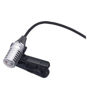
Windows Movie Maker
Adobe Premiere
And, Adobe Photoshop
Different media technologies have been vital whilst creating my documentary and each them required basic knowledge about them, however they also helped to apply better understanding as we continued to use them.
Initally, using a computer and the internet to research documentaries, and research information to go into the production itself. 'YOUTUBE’ helped to play a big part in researching for my product, as it allowed me to watch real and professional documentaries that had been created, i was also able to take screen grabs to compare my framing shots with the professional ones.
After gaining experience last year using the digital and stills camera I had a good idea of how to use it effectively, and did not have much trouble in getting used to them.
I had to re-familiarise myself with all the skills used when editing footage on the Adobe packages as it has been a while since i was last on them. After obtaining a little help i got the hang of them and was able to make the work a good standard.
Finally, the internet came into use for a second time when i was required to upload this blog onto blogger.com. This has made my blog look more neat and tidy as everything is in order and has a title.
> By using all of these technologies we were able to make the whole production realistic and professional. I have enjoyed the whole experience and i am happy with the finished product.
 'NEWSPAPER PRINT'
 This is the overall finished design for our newspaper print advert. It has the name of the programme, the slogan, time and day of scheduling and the BBC logo included on it, to make it realistic and professional. We decided to create it in this way because, we felt having the sweet larger in the middle (than the hands) made the whole thing stand out, and this is a code and convention of print ads - one main striking image. Having the hands come in from different angles of the shot portrayed the image as sterotypical and it also appeal to a family audience as it has hands of different age and gender.
 Politics
 BBC news...ask the right question
 World News
 Channel 5
 Channel 4
 used
used not used (lightening = too bright)
 used
used not used (lightening = too bright)
 not used (Paper doesn't cover whole of shot)
 used
used used
used Here is a professional set up for an interview and positioned to the left of the screen is the name of the actor and the relation to the interview, being her stage name in a film.